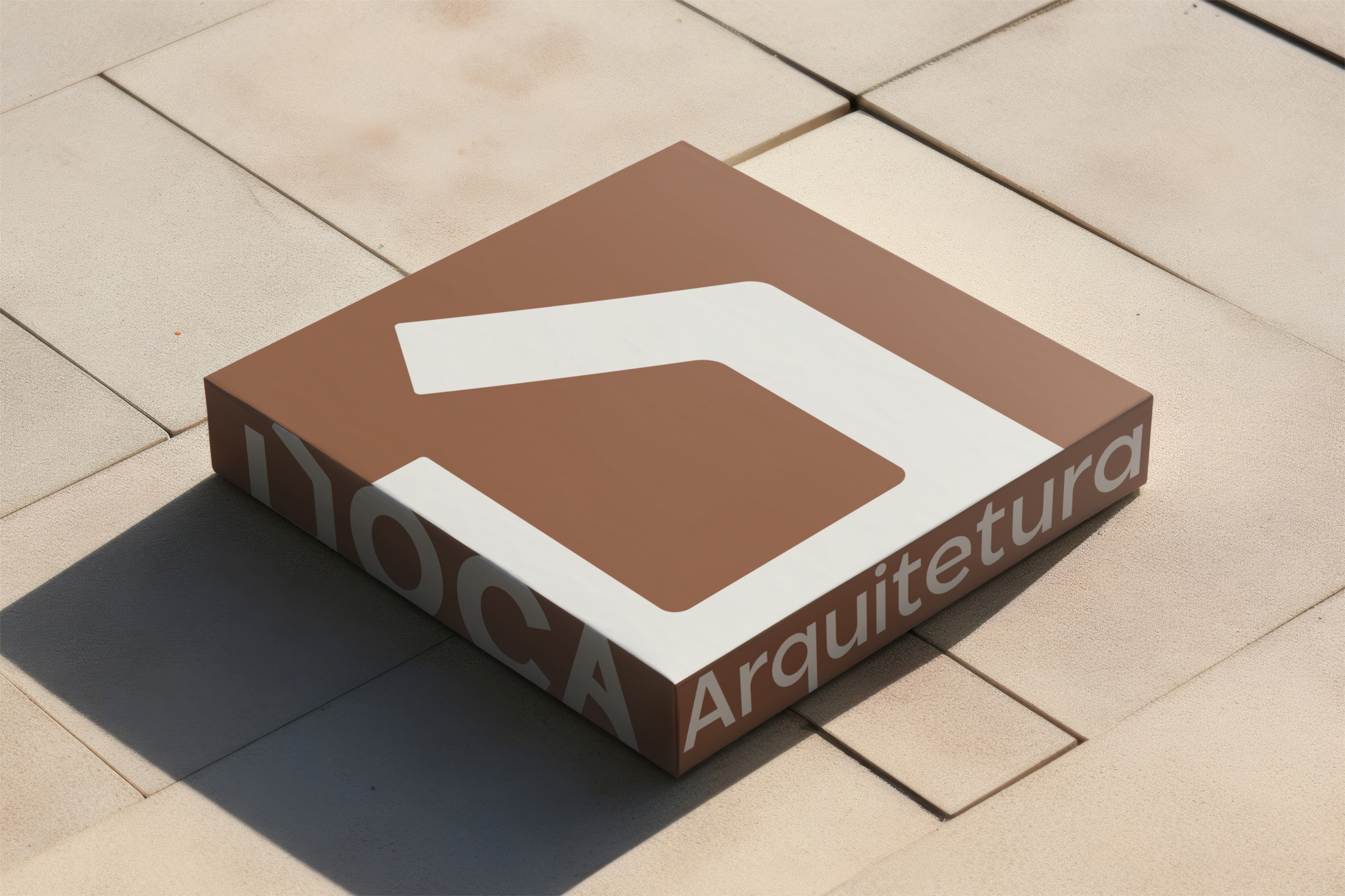
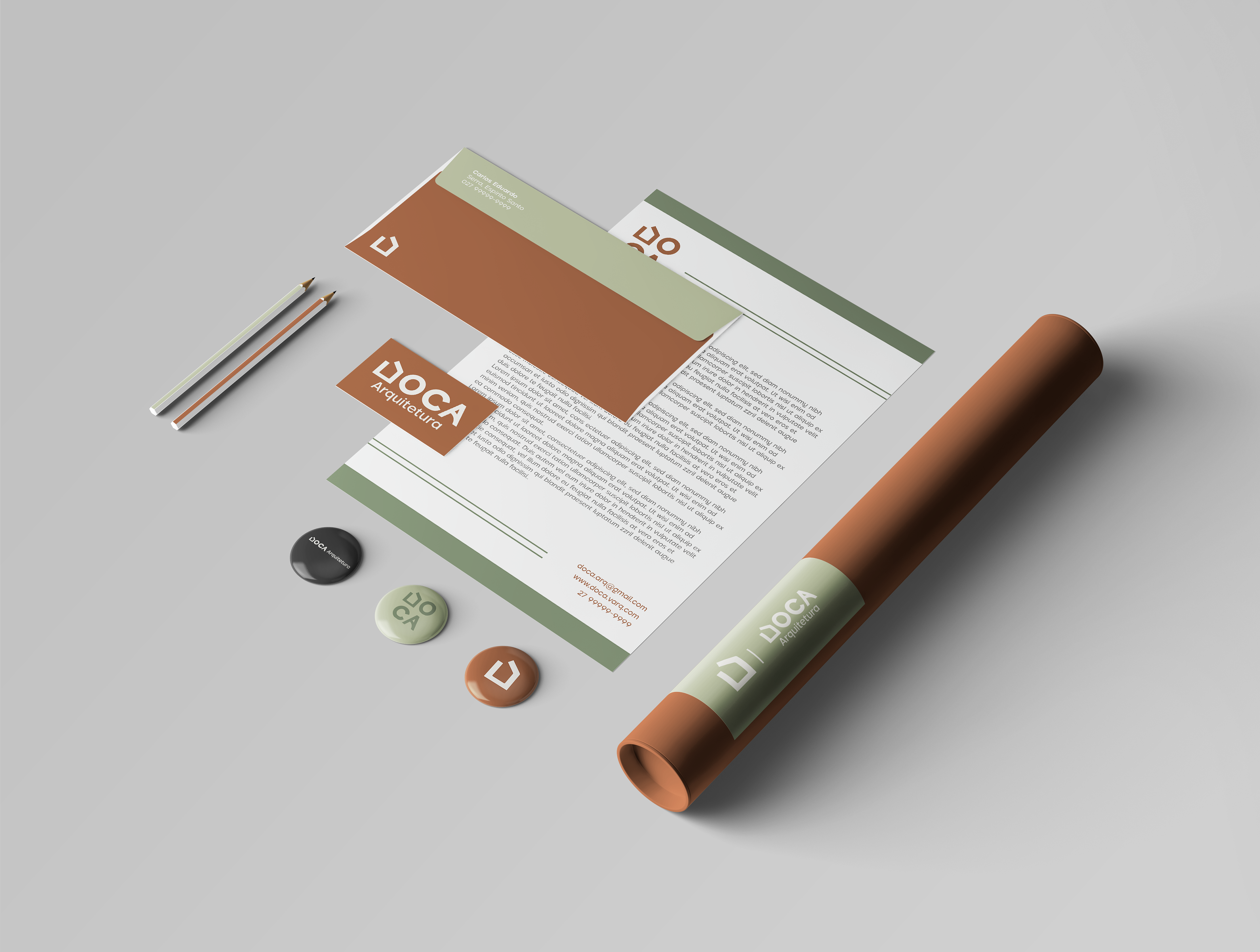
This brand was developed with the vision of creating a bold, modern, and innovative architecture company.
The client wanted a brand that could communicate effectively with both offline and online audiences, while also being integrated into the architectural projects themselves.
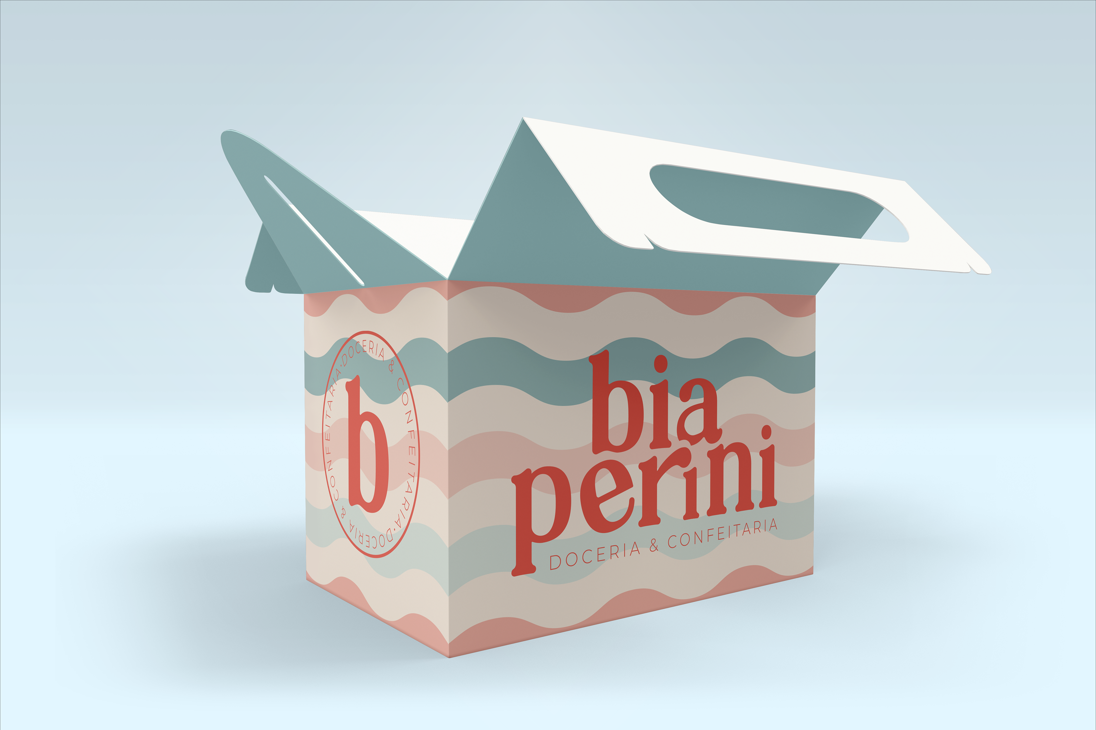
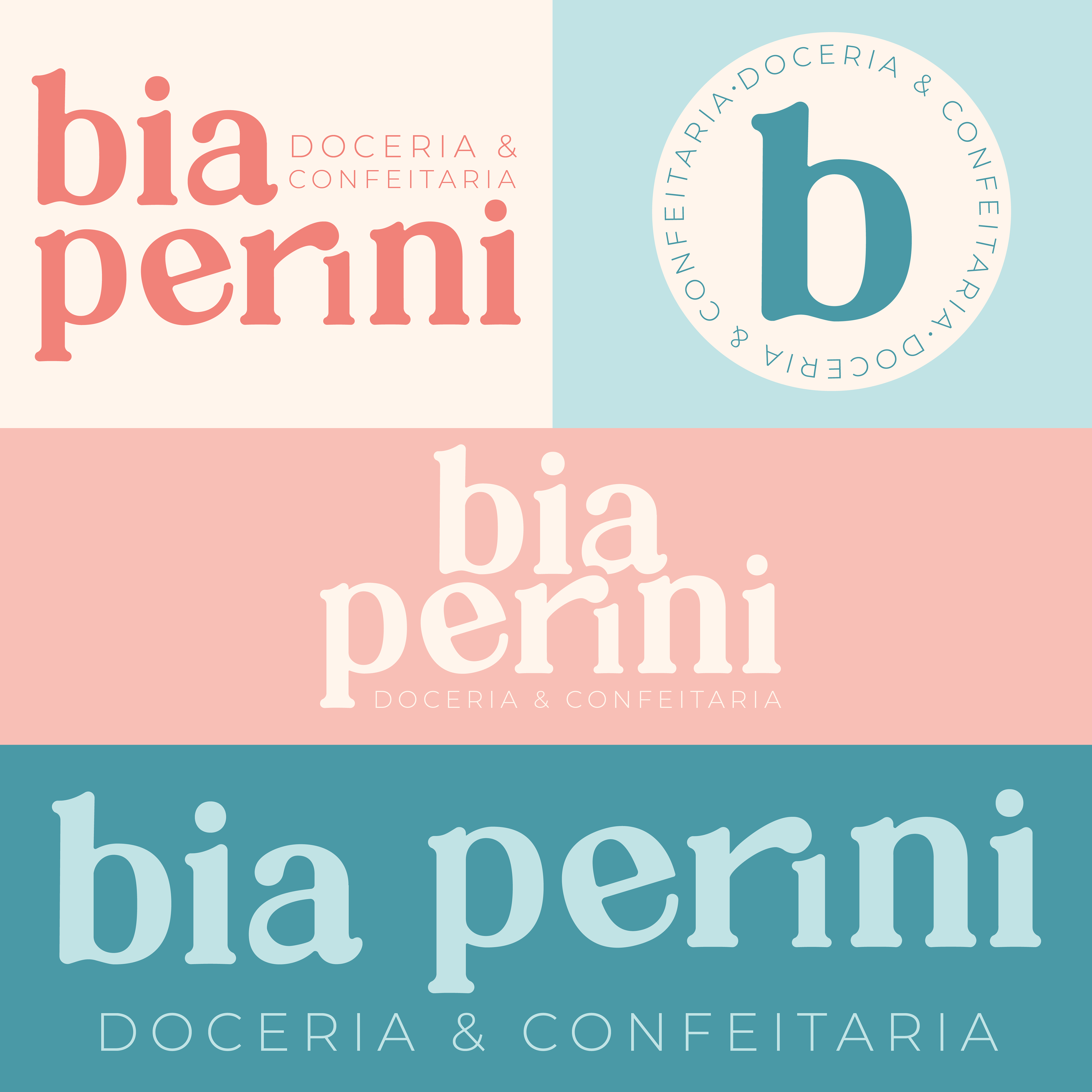
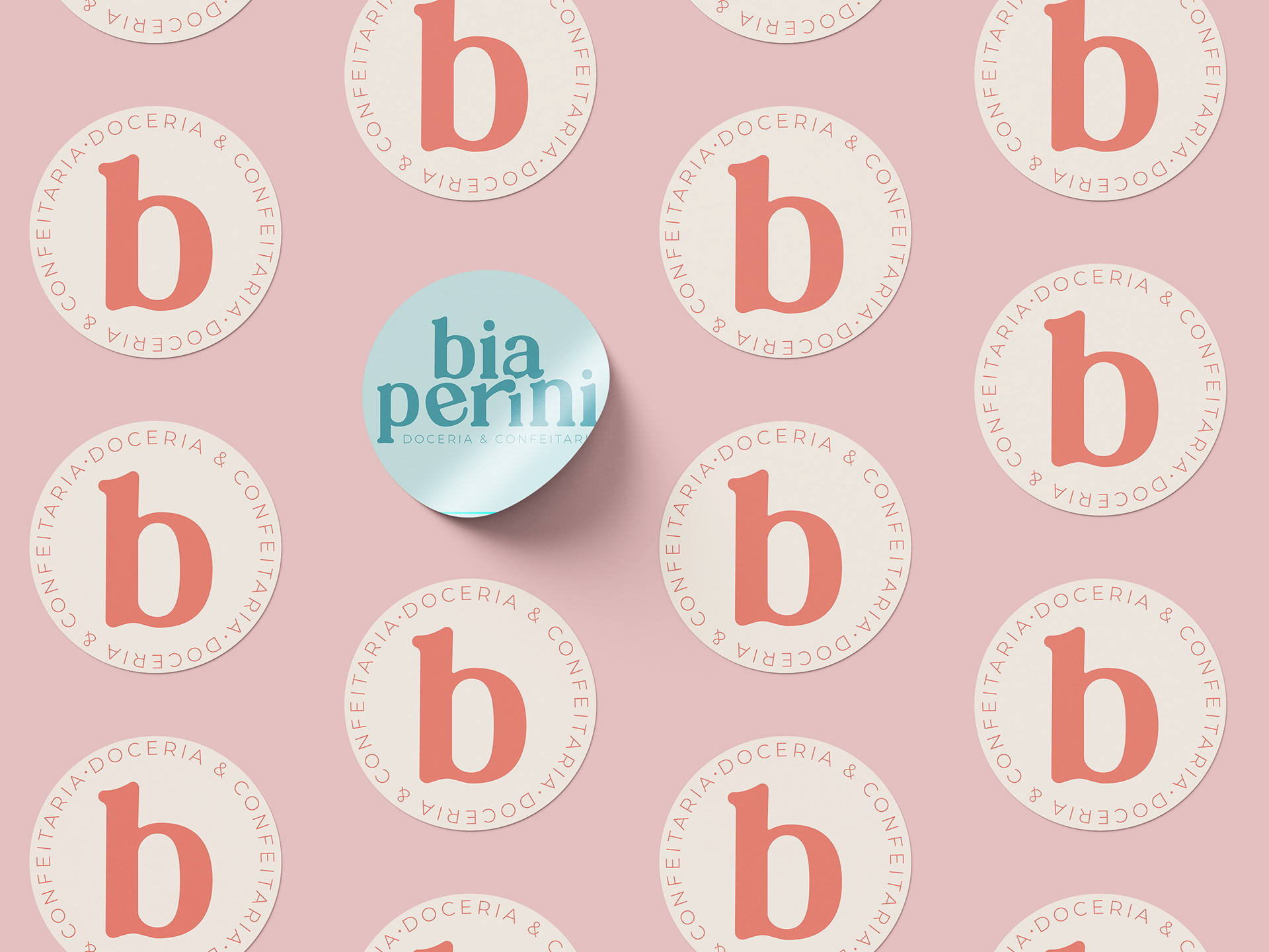
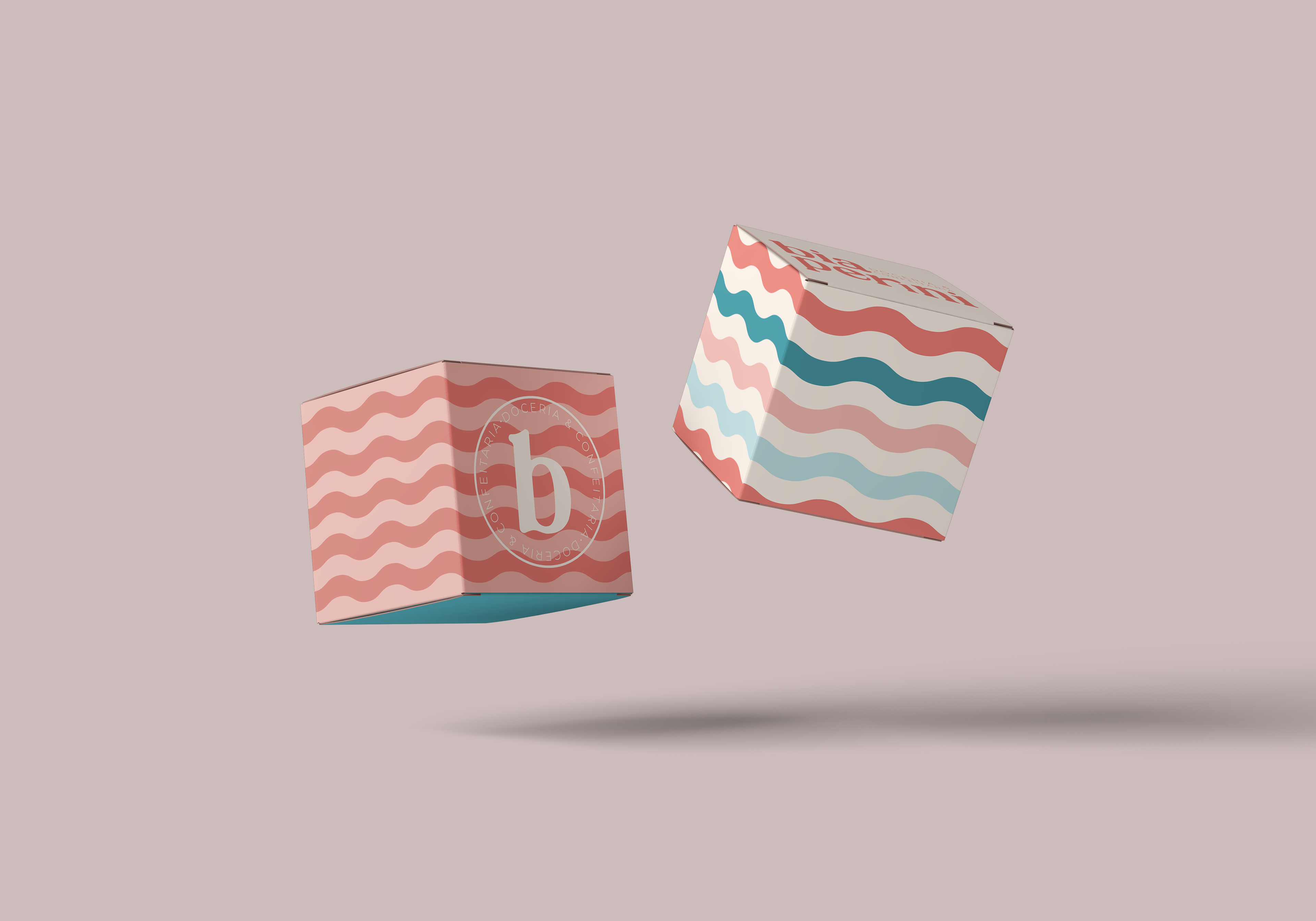
This brand was developed for a pastry company looking to elevate its visual identity.
The goal was to position the pastries as more than comfort food, but also as a gift-worthy experience. The client requested colors that would evoke desire while maintaining a balance between elegance and playfulness.
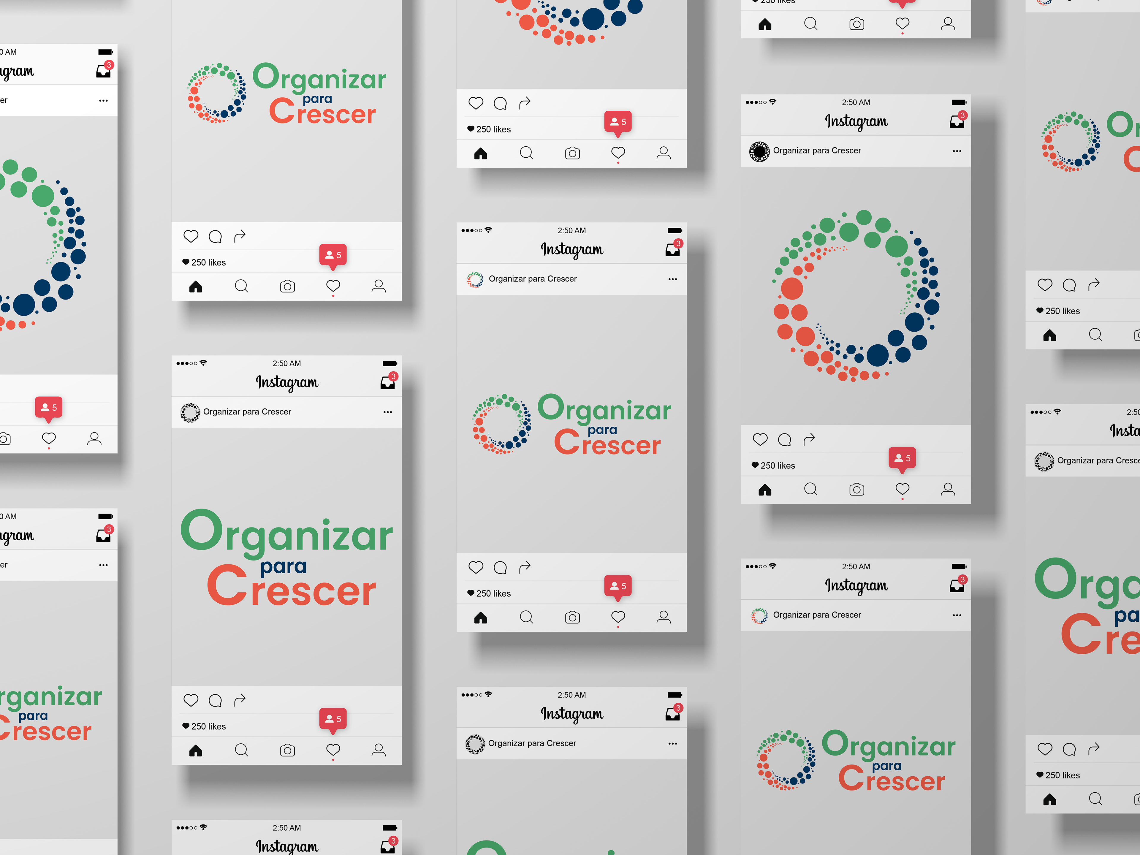
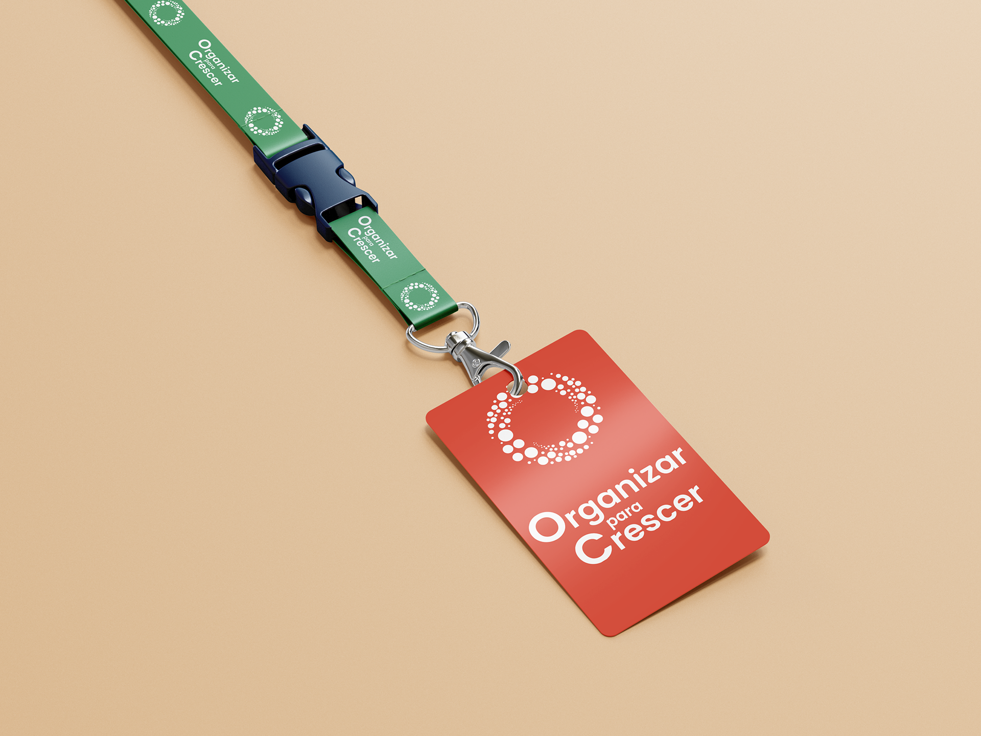
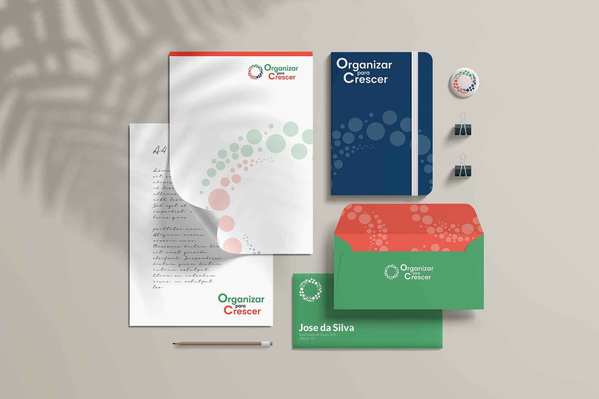
“Organized to Grow” was developed for a client hosting an event focused on supporting small businesses.
The concept behind the brand was to create a symbol that represents collaboration and mutual growth within the small business community. The client requested a color palette that would stand out while still feeling professional.